Cursor AI is an AI-powered code editor designed to enhance developer productivity by integrating artificial intelligence directly into the coding environment. It provides features like code generation, intelligent code completion, debugging assistance, and the ability to write or edit code using plain language commands.

Industry
Artificial Intelligence
Contact Type
Freelance
Key Focus Areas
About a year ago, my Twitter feed started exploding with this fantastic new application called Cursor. It was a VS Code fork with AI-powered capabilities that boosted development productivity. I immediately downloaded it and started playing with it. The idea was super clever, but one thing struck me with the initial opening of the app: The app icon was disastrous. I couldn't even look at it standing on my dock, so I made a replacement icon.
When it comes to icons, I rarely start with pen and paper sketching. Instead, I do lo-fi vector concepts that capture direction.
For this Icon, I wanted to preserve the original look and feel but make it more dynamic and add depth and polishing. The biggest challenge was to capture the Cursor's exact angle. I created a 3D object in Spline to use as a reference for the proper perspective. I didn't add any lightning to it, as I planned to do that in Figma directly.

I start with a generic grid template, defining the base's boundaries. The app will have a slight border, so I added an extra shape to extrude the surface and add a bit of depth. A base coloring from the initial icon color palette casts a diffused lightning from the bottom up. Next, I apply the basic shape, an exact vectorized match of the reference 3D object. From there on, I add multiple layers and shapes to create proper volume. I've also added optically aligned highlights and shadows once the main cursor shape is done. As a final step, I have added a subtle grid that mimics CLI's strict dimensions. This provides structure to the background, which amplifies the depth effect.
When I'm happy with the icon, I usually explore a few variations that slightly deviate from the initial requirements and consider different ways to present it. I experiment with layers, depth, colors, and structure while preserving the overall icon's visual feel.


I tweeted a mini case study on Twitter and got immediate response by the Cursor founders, who seem to like my concept.
I emailed right away and we started immediately working on the final version. Most of the feedback circulated around the usage of colors, as it appeared they are not fan of the actual color scheme.
I followed back with another round of variations and a fresh color scheme:

From the second batch they picked the winner. The final version was pushed to the production in less than a week. As a part of the delivery, I prepared few media assets, such as cover image and profile photo, and few post covers in case they want to publish the update somewhere.


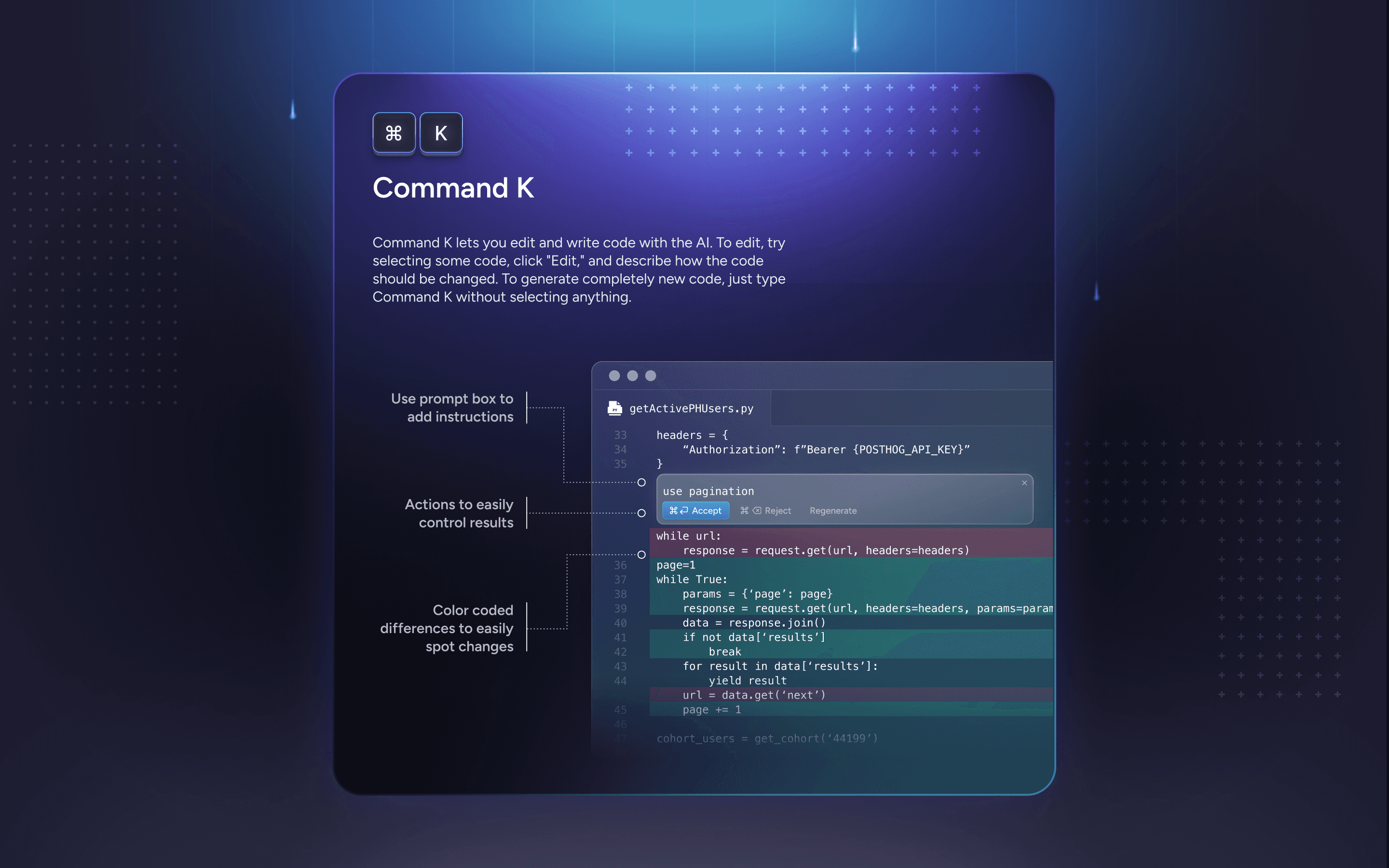
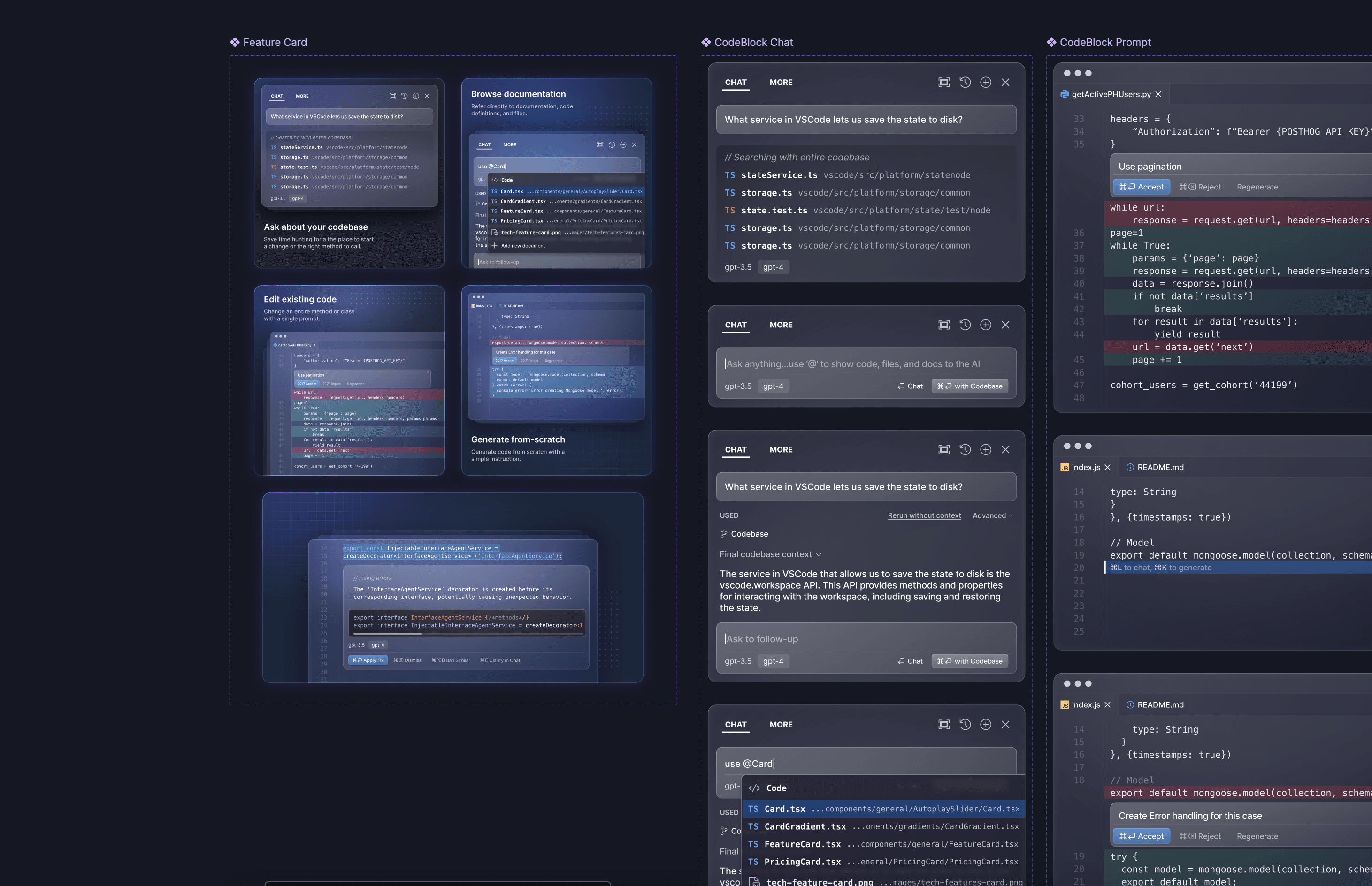
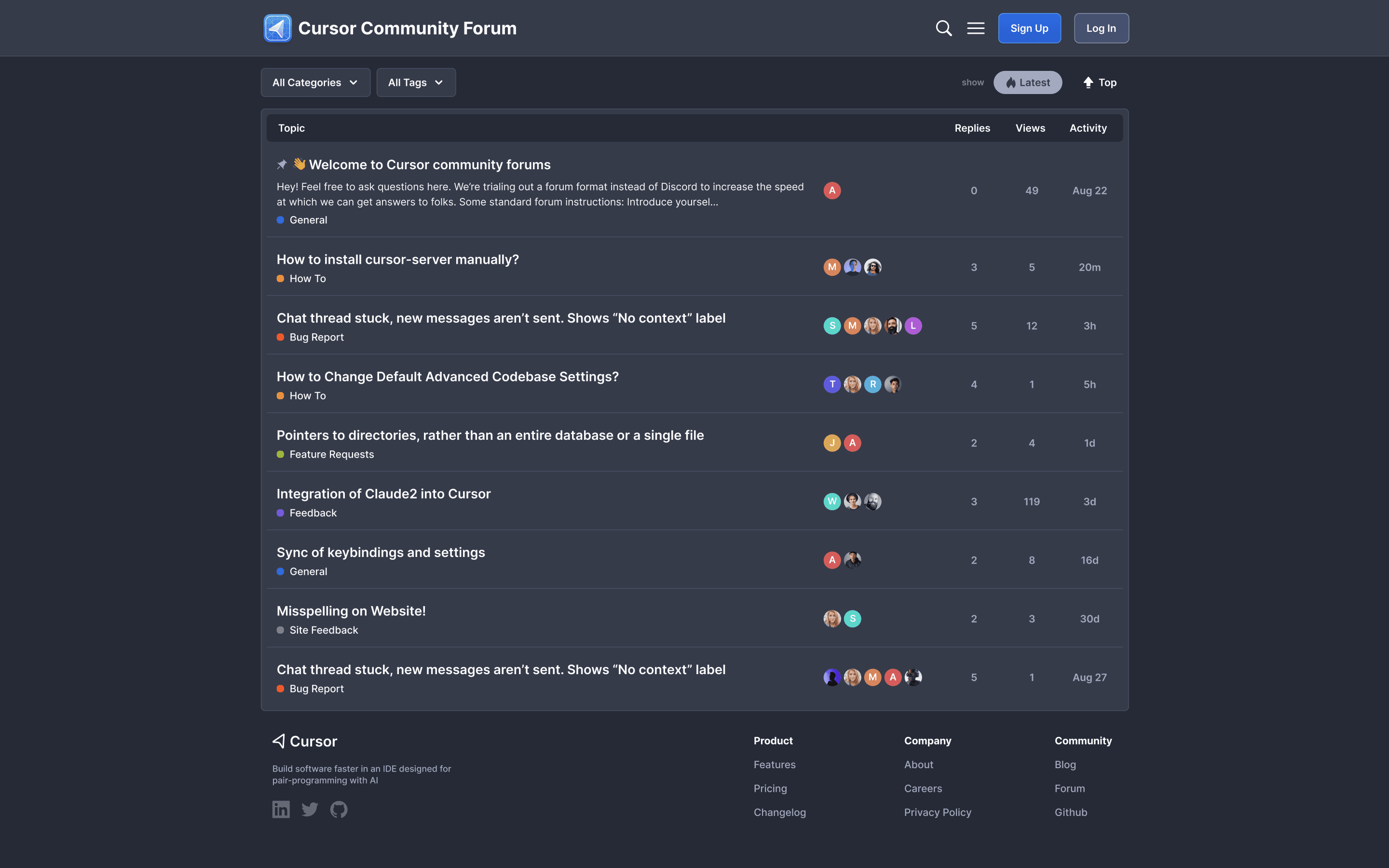
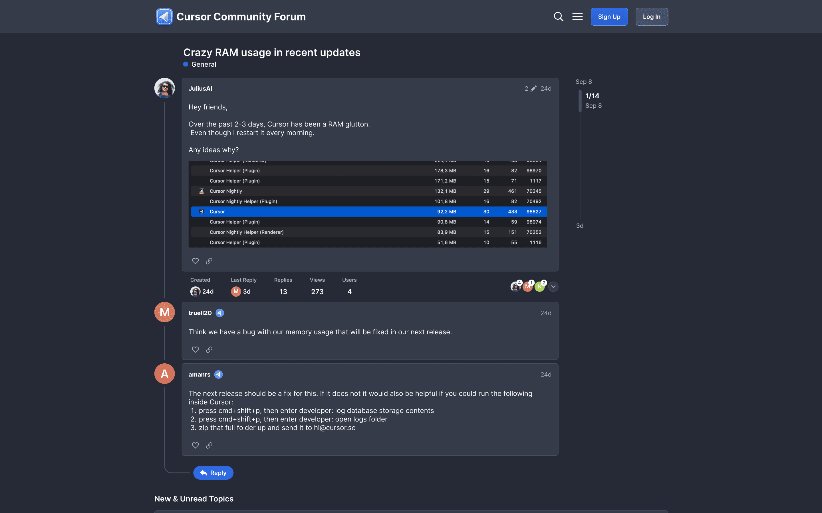
We began working together under the terms of my design-as-a-service subscription, which I offered at my design agency, Last. I've been directed to multiple areas where they would like to make some visual improvements. I made an attempt to enhance their website's visual appeal and align it with the newly introduced icon. The focus was more of a facelift of the current visual aesthetics rather than a complete redesign. I made suggestions and provided ready-to-implement mockups of the website and its components, bento-like grids, and rich information feature cards. I also did an in-app onboarding series and provided improved designs for their community property.